
SHAREK: “We believe that language and culture are better shared than taught.”
CHALLENGE: Yousef Omar, a highly respected professor of Arabic language and culture, with years of experience teaching at SOAS in London, had hit a wall. Frustrated by the old-school methods still being used to teach Arabic, he decided enough was enough. He stepped away from the traditional academic world to forge his own path. Yousef came to us with a bold idea: to create a new start-up brand that would completely shake up how Arabic language and culture were taught. His vision? A fresh, group-based learning experience that goes beyond textbooks. Students wouldn’t just learn the language - they’d immerse themselves in Arabic dialects, culture, food, drinks, and the full sensory experience of the Arab world, together. It was a radical shift, and we were all in.
SUCCESS: Yousef always measured success by people, not profit. Sure, he needed to keep the investors happy and build a profitable business, but his real passion was creating something bigger - a new school in central London, packed with students from all corners of the globe, learning Arabic language and culture in a fresh, exciting way. We helped him tick both boxes, and along the way, we shook things up and carved out a solid chunk of the market share from the old-school usual suspects.
SERVICES:
• Brand strategy
• Brand name
• Visual identity
• Website
• Investor decks
• Print
• Video
• Animation
• Illustration
• Interiors (art direction)


Modern colourful classroom for Arabic language school

Sharek name breakdown
Person eating pastry out of bag and coffee on table


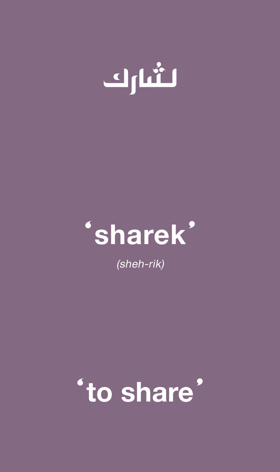
Our first job was helping Yousef land on the right name for his new venture. During the brand workshop with him and his team, the conversation kept coming back to one key idea: finding a fresh way to share Arabic language and culture. That word - sharing - became the heart of the session. A quick dive into Google Translate later, and we found the answer: the Arabic verb for ‘to share’ is ‘Sharek’. Job done.
Sharek Brand message
London Buses driving past poster

Man walking down street in London

Cyclist riding past a roundabout in London

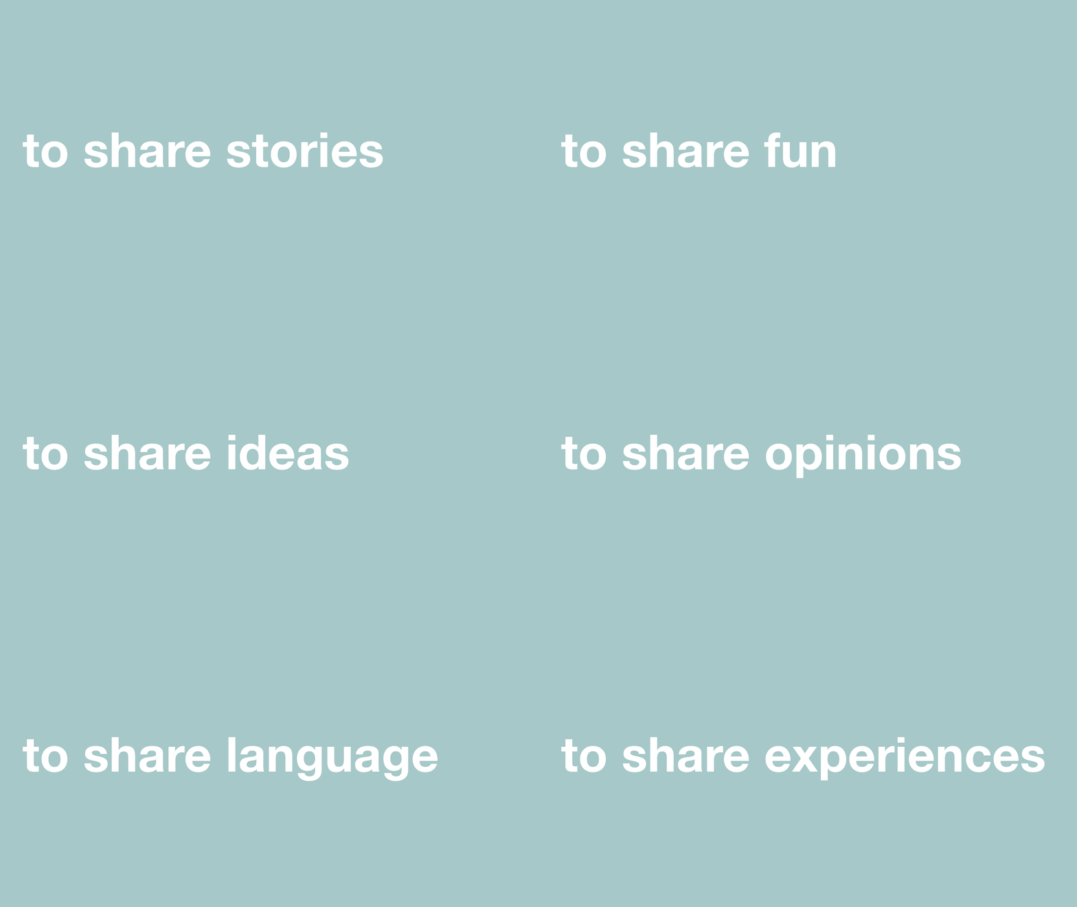
The 'big idea' behind Sharek is all about bringing people together - no matter their age, gender, race, religion, or background - to share their knowledge and experiences. It’s all about learning and growing as a group, with open and free-flowing dialogue between students and teachers at the core.
We created a brand identity that brings this vision to life using speech mark icons - a simple yet effective graphic tool that forms the logo and evolves into the visual language of the brand. It’s a nod to the idea of conversation, connection, and collaboration.
Banner ad on London street

Bus stop ad on London street

Taxi driving past bus on London street

London black cab with advert

The new brand's visual language is built around a tight set of assets: speech mark icons, Helvetica Neue Arabic font, a colour palette inspired by vibrant Arabic mosaic tiles, hand-sketched illustrations, and candid group shots of people connecting. We wanted to keep things young, fresh, and approachable - steering away from the more traditional, serious vibe that some of the conservative Arabic language schools in the UK have. The goal? To make the brand feel fun and open to new ideas, just like the learning experience it offers.

Woman with newspaper walking through London underground train station

Person walking past underground Station advert

Man walking down the stairs of a London underground station

Platform of a London underground station

Yousef came to our studio in a mild panic during the first week - he needed the new brand identity ASAP for a holding page and some business cards ahead of a big investor meeting the next week. No pressure. We delivered and the meeting went brilliantly. The investors were all in, giving us the green light to keep building and launching the brand.
Person reading the guardian newspaper on an iPad

Next up, we crafted a marketing content and activation plan to get the Sharek name out there across London.
For the first campaign, we kept things stripped back. The concept of sharing was front and centre, with a simple call to action, website, and the Sharek logo (complete with a translation). No overloading with course details or timetables - just clean, clear, and focused. While most language schools crammed their ads with info, we let the idea of ‘sharing’ do the talking. The ads rolled out across the tube network, TFL, taxis, street posters, and appeared in print and online with The Guardian and The Evening Standard. Simple, effective, and straight to the point.
Premium business cards created for London Arabic language school Sharek

Man and woman having a discussion

Arabic Language tutors having a discussion
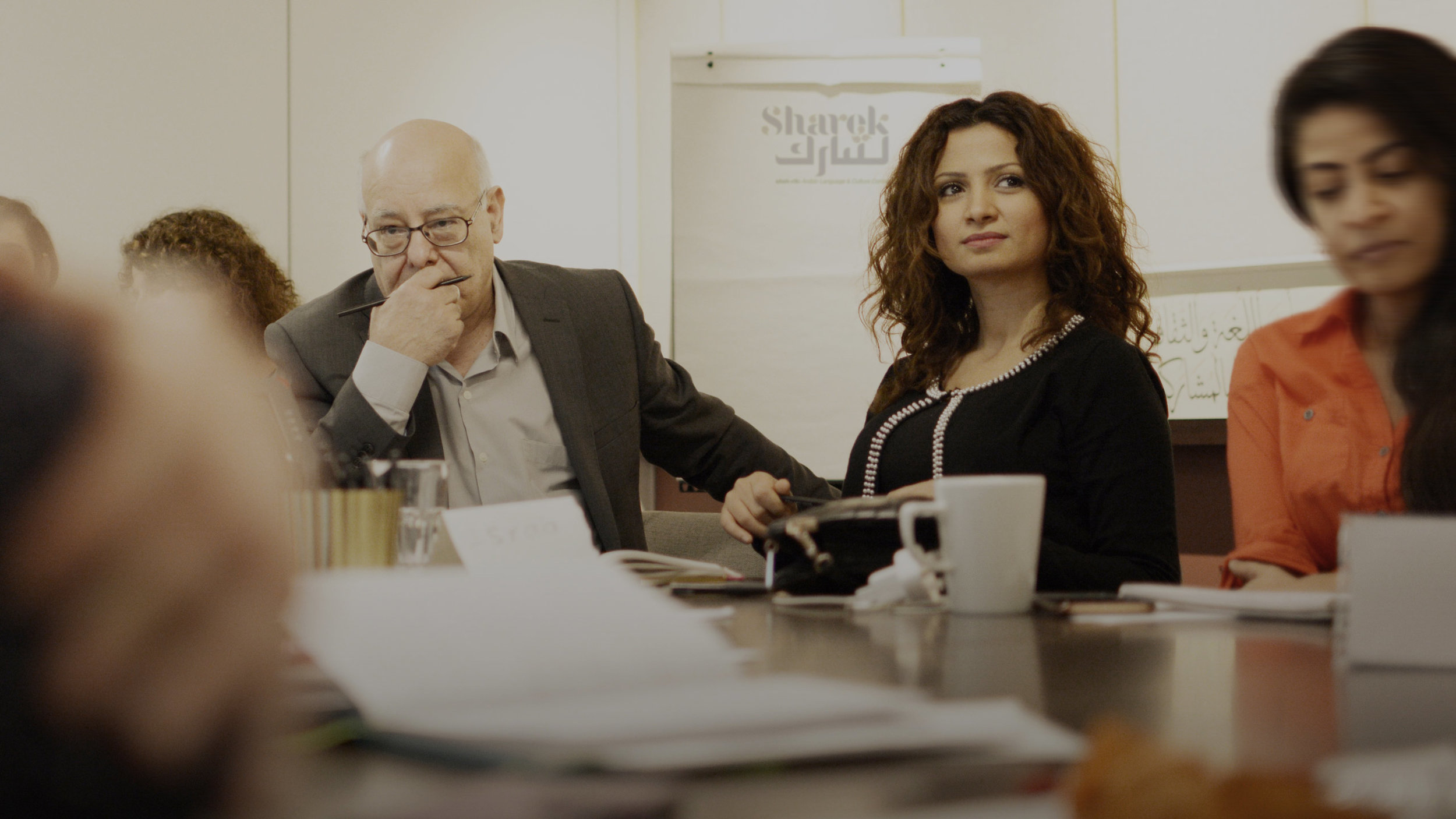
We had to figure out how to reach people who didn't have the time (or patience) to sit down and read through the website or ads. So, we designed and produced six short animated films, each one highlighting a different side of the brand. These were shared across the website and social media, giving people a quick, engaging snapshot of what Sharek is all about. Simple, effective, and perfect for today’s fast-scrolling audience.
SHAREK UPDATE JAN 2025: Everything was on track for Yousef, his team, and the investors—until the pandemic threw a stick in the spokes, hitting the education sector hard. But Yousef didn’t miss a beat. He pivoted, taking the Sharek concept in a new direction with ETQAAN - an online Arabic learning platform based in Dubai. We worked with him to create the full brand package: strategy, name, visual identity, and website. The result? A seamless shift into the digital space, ready to take on a new chapter.
Large colorful digital advert for sharek and coca cola

